Friday, April 24, 2015

Photoshop Final

Photoshop Final

Difficulty: ?/10

It's finals week and we're all studying hard. As the school year comes to an end, so does this blog, but not without its own final.
"What? A final?"
Yeah, a final. A test. A test going over things you should have learned from this website.
"But your blog is about tutorials!"
Yeah, it is. It's about tutorials to teach you, and the best way to make sure they've taught you is a test, this test. So here it is:
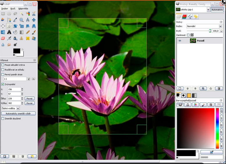
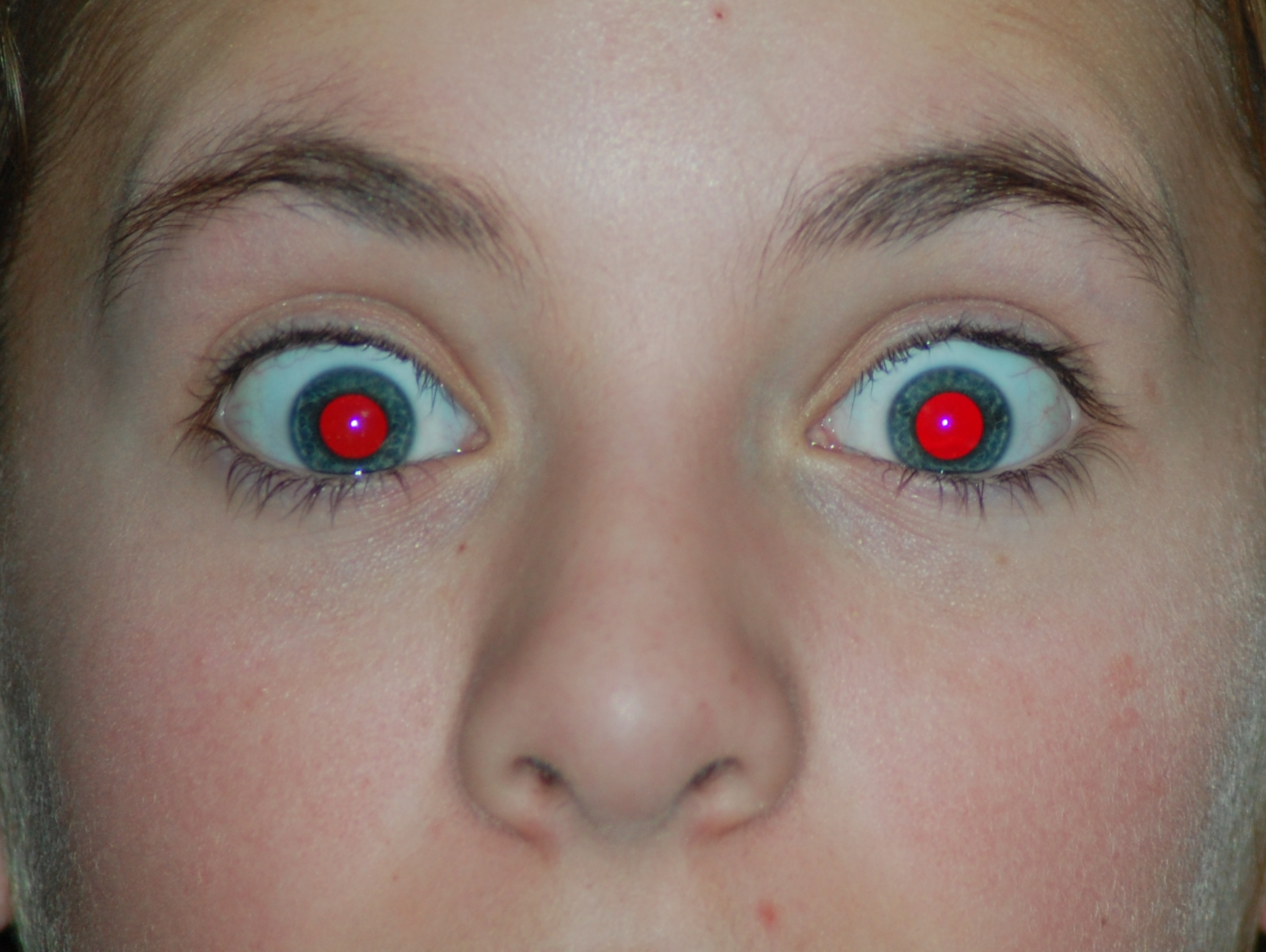
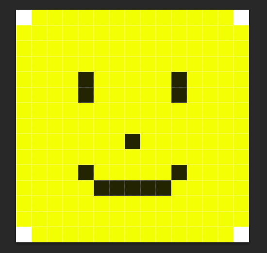
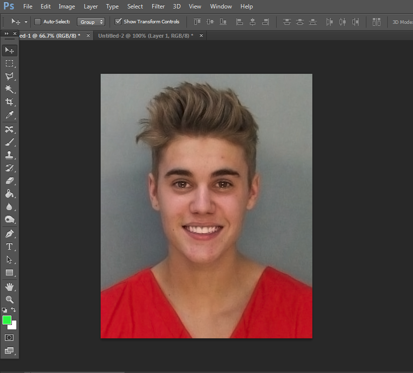
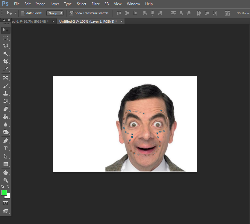
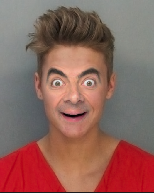
"Woah? What is this thing?! It's crazy! It's ugly! This isn't a pretty picture!"
You're darn right it's ugly. But it's your final. Right click the picture and save the image. Here are the instructions to fill out and complete this.
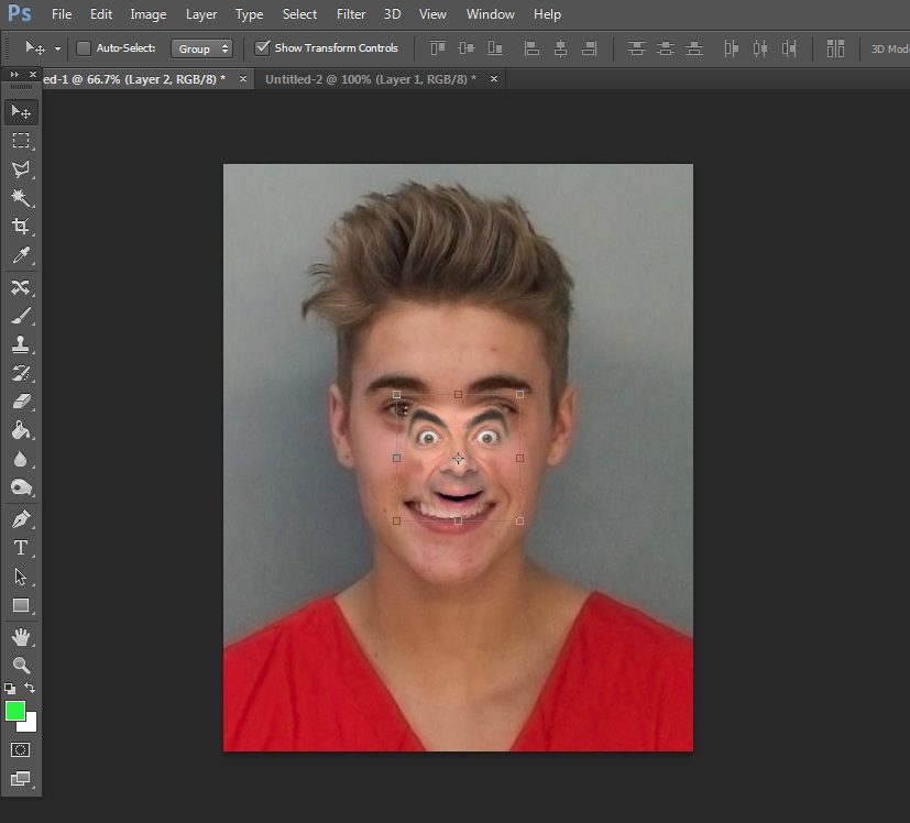
Box 1: Edit this face into a funny, ugly face.
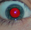
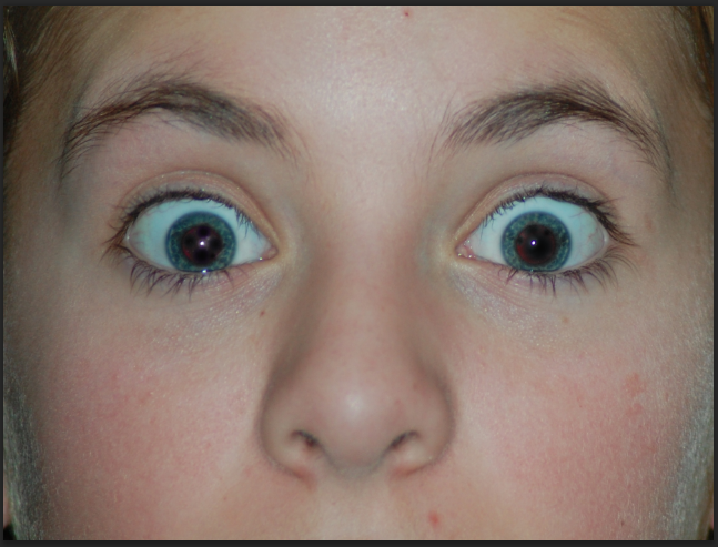
Box 2: Remove the "red eye" from this photo.
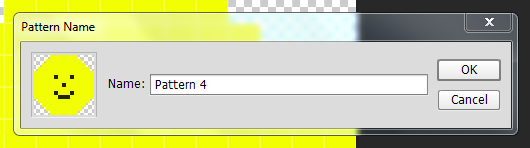
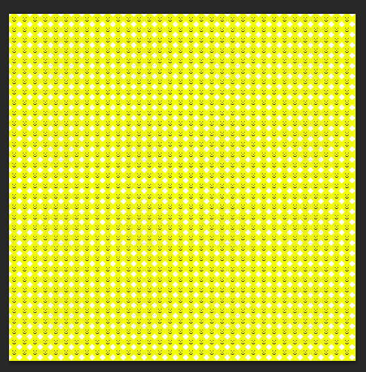
Box 3: Fill in this box with a pattern.
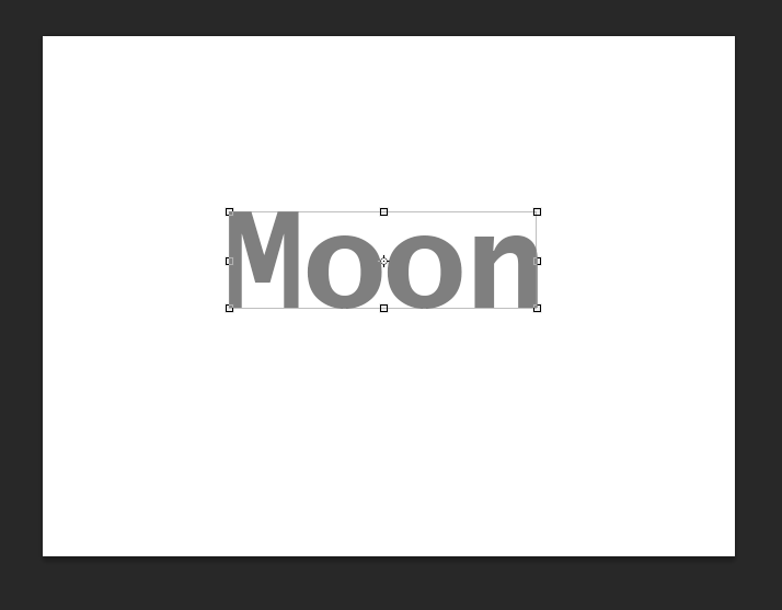
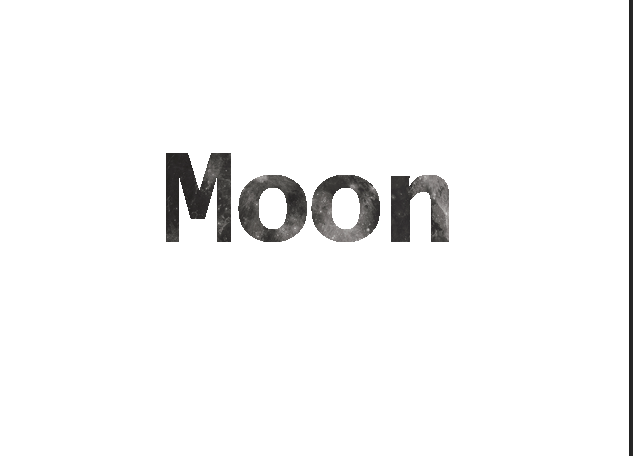
Box 4: Type in the word Sun but have it look like the sun.
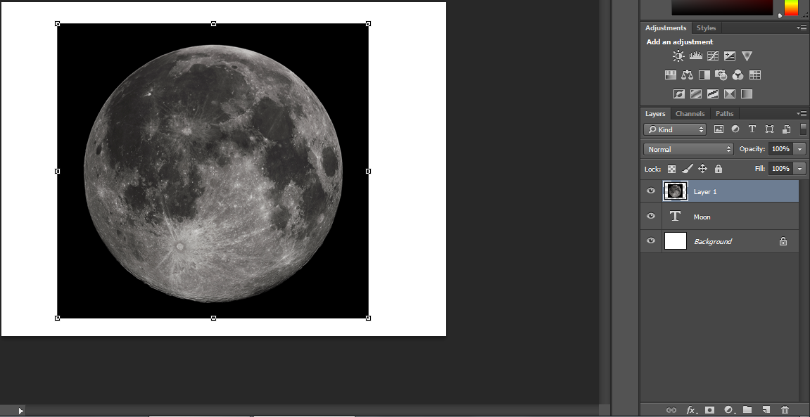
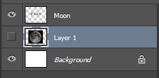
Box 5: Remove the Moon.
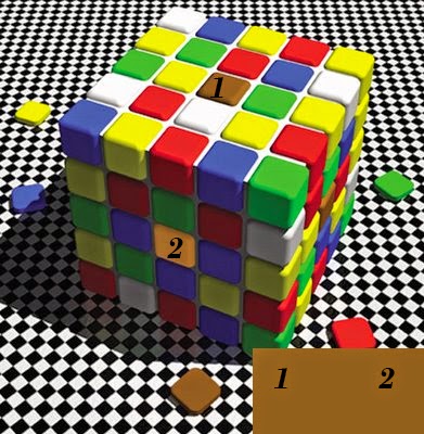
Box 6: Use a tool to find out which color 1 matches. (No guessing, show your work!)

Now, the answers! No cheating, only open this AFTER you completed the final.

Answer Key

If you can answer all of these correctly, you have learned a lot from this blog, and I hope it went well! Of course your answers won't be the exact same for some of these, but your picture should be somewhat similar. 

Since this blog is coming to an end, here are two more tutorial sites that offer tons of tutorials:

Here and here.

Thanks for reading this blog, and like always, comment with any questions or comments!


Friday, April 17, 2015

Photoshop vs Gimp

Photoshop VS. Gimp

(And which is best for you)

Today instead of a tutorial I'm going to be talking about Photoshop and Gimp, which one I think is best, and which is best for you.

First, take a look at each of their websites.
Photoshop
and

I'm sure by now you can assume what these are. Photoshop and Gimp are both photo editing software, just different brands. And we all know different brands will offer you different things. The major difference is that Gimp is 100% free while Photoshop is not.

Personal Favorite

I'm sure as most of you can guess, I prefer Photoshop. But why? I prefer Photoshop because I believe it is much much more polished, it offers a variety of different features, like 3D modeling, animating, and more. Look at all of my other posts to see what Photoshop looks like. Now here is what Gimp looks like:
See what I mean by less polished?
While I understand that Gimp is less costly than Photoshop, it has it's reasons. You pay for what you get in Photoshop. It's $10 a month and it's worth the payment for the features it adds. But this doesn't mean it's best for you. This is just my preference.

Which One Should You Get?

There are only two reasons you should get Gimp over Photoshop. Intentions and money. If you plan to just edit a couple of photos and be done, Gimp is for you. It may not have everything Photoshop, but it also doesn't cost $10 a month. If you plan on editing lots of photos, are serious about photo editing, and can make $10 a month, I'd say most definitely go for Photoshop.

As always, if you have any comments, questions, or counter-arguments in this case, comment below!

Friday, April 10, 2015

How to Remove Red Eye

How to Remove Red Eye

Difficulty: (1/10)

While "red eye" may not be a common problem nowadays, it's still nice to know how to remove it if the situation ever arises.
To learn more about red eye and what causes it, you can read this article.

Now, the first step to fixing a picture with red eye is getting a picture with red eye. I'll be using this picture:
Next go over to this band aid looking tool:
and hold it down and select the "Fix Red Eye" tool.
Now click and drag over each eye on at a time multiple times like so:
Do this multiple times until the eyes look normal like this:
While this tool may not be perfect, you can look at my past tutorials on trying to find out ways to fix this!
For more tips or tricks on fixing red eye, check out this tutorial.
Comment with any questions or comments! Thank you!

Friday, April 3, 2015

Make Your Own Pattern

Make Your Very Own Pattern

Patterns are everywhere! They're in your wallpaper, your cereal, your shirt, and more! They even help kids learn. While I may not be talking about that kind of pattern, there is no denying that patterns are amazing and you want to make your own, no questions asked. So here we go, making your own pattern!
First, make a new image. Your pattern will most likely be small so set your image to something small like mine is at(15x15 pixels):
Now you're going to create whatever you want your pattern to be. When drawing with such a small image, you'll want to use the pencil tool. It looks like this:
Now, when you make a pattern I think it's best to leave lots of blank area. When you use a pattern tool it fills a whole entire image/selection with that area. If you don't leave much blank area, it'll look like one big mixed together blob.
Here is an example of a picture I WOULDN'T use as a pattern template:
Here's an example of a picture I WOULD use as a pattern template:
Notice how much extra blank there is? This will allow for more of the background of the patterned on item to be visible.
Next, use the magic wand tool to select the white areas and delete them. If you can't delete them look at your layers and make sure there isn't a lock on your layer. If there is, click it to remove it. You should have this:
If deleting some of the white area fades the color of your pattern template, recolor it.
Next, select the whole image by pushing Ctrl + A. Then, push image, create pattern, and name it whatever you want. The box should look like this:
Now open up whatever you want to put your pattern on. I will be using a blank canvas just for example purposes.
Go to the bucket tool that looks just like this bucket:
Go to this box:
and set it to pattern. Now, select the pattern you just made so it shows it in this box:
Finally, with your bucket tool selected, click on your image wherever you want! Here is my final result:
And there you go! You can start patternizing any image you want!
If I missed something or you want to check out a step more in-depth, you can check this tutorial also!
Like always, comment with any questions or anything at all really. Thanks!

Friday, March 20, 2015

Custom Text

How to make Custom Text

Difficulty: 2/10

Look at this picture. And this one too. Isn't it really cool? It is. You want to learn how to make something like that. You WILL learn how to make something like that. So let's start.
First, open up Photoshop and make a new file, any (REASONABLE) size. You'll have a nice, blank canvas.
Move on over to the Text tool. It happens to look just like this:
Click it, and type what you want to type. For my example, I'll be doing the word Moon. Adjust the size to fit your blank canvas. Here is mine:
Color doesn't matter, it'll be a picture soon anyways. Then, copy and paste the image you want as the background. CTRL + C copies the image and CTRL + V pastes it. This will open the picture in a new layer. Resize the image to fit your screen. Here is what mine now looks like:
(Notice the layers.)
Now, drag the moon layer behind the text layer, click the eye so the image is hidden, and right click the text layer and click "Rasterize type". Your layers should now look like this:
Now, go over to the tools and click the magic wand tool. It looks like this:
Go to the top and set it to the addition setting here:
Now, click each letter (make sure you have the text layer highlighted) so they are all selected. Now, switch the the moon layer (With your selection still made). Make it visible and push CTRL + SHIFT + I and then push Delete. This will delete everything but the text. Delete the whole entire text layer. After all of that is done, you should be left with this:

And that's it! Your desired text is now a picture also!

My tutorials are starting to be less slightly in-depth to adjust to developing skills. If you have any questions about any steps or any comments, feel free to comment!
If you have any other questions, you can follow this tutorial also!

Friday, March 13, 2015

Face Changing

Face Changing

Difficulty: 5/10

A looot of girls are attracted to Justin Bieber. Some guys are willing to go out of their way to look like him. One fan even payed over $100,000 to look like Justin Bieber, with... mediocre results. What this fan didn't know is that he didn't have to pay $100k to look like him, he could have payed $10 a month for photoshop! A couple of simple tricks and he'd look just like him. What tricks? I'll show you the tricks all right.

Okay, now this tutorial is for more than just looking like Justin Bieber. With this tutorial you'll be able to take someone's face it put it on someone else's body, so let's get started!

First pick the two faces you want to use. One face will be the one we copy, and the other will be the face we paste it onto. I'll be using Justin Bieber and Mr. Bean, with Mr. Bean being the face we copy, and Justin Bieber the receiver. 
Open them both up in Photoshop. (If I skip any basic steps, like how to open files, check to my older tutorials on how to do so.) Your screen should now have open two tabs. If you happen to be doing Justin Bieber and Mr. Bean your screen will look like this:
And this on the next tab:
Now, what you want to do is select the tool that looks like a pen. It's right below the tool that looks like a hand. Look at the image above to see a reference. Next, select around just the eyebrows, nose, and mouth on Mr. Bean. This tool is like connect the dots. When you select one point, it adds a dot. When you select another, it connects the two. You should now have this:
Next, right click the selected  (with the pen tool)  are and push "Make Selection..." Guess what happens? Guess guess! This window!! :
Now, your box will say "Feather Radius: 0 pixels" but we're gonna change that to... guess again! 5! and push okay. You now have this;
Once you have that, push Ctrl + X and it'll cut out the picture. Now, swap to Ol' Justin Bieber, and push Ctrl + V. Here's your new screen:
Drag the corners of the image to line it up. Shift + draging a corner will enlarge to image proportionately . Play around with it until you get it JUST right. 
Once you get it all aligned and any other kinks worked out, you'll have your final image. Get prepared because here comes the final result of mine!
If you look at it for a little bit you'll notice some slight color differences between the top of Mr. Beans face and Justin Bieber. To fix problems like this or if you just want to know more about methods like this, check out this tutorial for more info!
Like always, comment with any questions or comments!


Thursday, March 5, 2015

Perspective Tool

Perspective Tool

Difficulty: 3/10

Don't you hate it when you're in an argument, a real heated one, and someone says you need to "take a step in their shoes" or "change your perspective?" Well heck, I'm going to teach you how to do just that, how to change your perspective using Photoshop! Now this may not be what they mean by changing your perspective but they can't deny that you tried, so let's start!

First, pick the picture you want to change the perspective on. I'll be using this picture that was originally posted here. 

In Photoshop click File, then Open... and select the picture from wherever you saved it. Your screen should now show your picture. 
Now, what you'll want to do is click edit and then Perspective Warp. 
Next just left click. A rectangular box will pop up, like this one:


You'll want to take the corners of the rectangle and drag them to the corners of one side of the building or object your changing, much like how I did below:

Then, shift click somewhere else on the picture. Another rectangle will pop up. Drag the corners to the corners of the other side. The corners that meet up should pop together. Your picture should now look like this.
Now, click the Warp box in the top middle leftish of the screen. It looks a lot (almost exactly, probably exactly) like this:
Now when you click and drag on the corners they will move. Experiment around with moving them to get the perspective you want. If you Shift + Click on a corner it combines the top corner and bottom corner so they move together. Shift + Click undoes this. Here is an example of what this tool can do:
Note two things here: First off, the slight difference in perspective. It looks as if you're standing at a different spot than the original picture. Second, the edges of the picture are distorted, this is a con of using this tool! Reading past and future tutorials can teach you how to do things like remove the edge errors though! If there's something I didn't cover all the way (these are basic simple tutorials after all) check this post for some more things, the post has a different perspective than I do!

Hopefully this taught you some new things, and like always, comment with any questions, complaints, or anything really.


Friday, February 27, 2015

The Dress (Dropper Tool Tutorial)

Color Analyzing

Difficulty: 1/10

What comes to mind when I say Blue and Black or White and Gold? 
If it's not this picture right here, you forgot to pay your internet bill. 
If you are one of the few who have yet to see this picture, let me explain it to you and the two types of people in this world. There are the people who see this dress as blue and black, and there are the people that see this dress as white and gold. Now, I know what you're thinking, "There's no way that dress is X and X, it's X and X!" And that's what I thought too. It looked 100% blue and black to me, but after showing it to some friends they thought it was white and gold. So go ahead, look at this picture, decide what color it is, and show it to a friend.

So how can I make a tutorial out of this? Well I'm going to teach you guys how to analyze the colors of a picture so you can tell what the true colors of a picture really are. Then, we will apply this newly learned skill to the picture of the dress and find the TRUE color.

So first what we all will both do is take a sample picture. I'll be using this picture for reasons that will be obvious later.
Open it on Photoshop by clicking File then Open and select the file.
Your screen should now look like this:

Then, add a white rectangle to the bottom right of the picture by selecting the rectangle tool and adding a white filled rectangle. Your picture should now look like this:

(Remember these next couple of steps, we're going to repeat them once more)
Next, get the dropper tool. It's the tool I have selected here.


Then, select the color that you want by clicking on the color you want. I'll be selecting the area labelled one and then when I repeat these steps I'll be selecting the area labelled two.

Next, make another rectangle over half of the white rectangle. By default, since you used the dropper tool, the rectangle will be the color of the selected area (Our number 1).

Now, repeat the past couple of steps up to the point where it said you'd repeat but use the second color you want to use.
(Optional: Add 1 and 2 or lines connecting to the correlating rectangles to show what color is which)
Make another rectangle and put it next to the first one. Your finale image should look like this!

If you were following along (or looked at the picture right above this text) You'll notice that 1 and 2 are actually the same color! Due to the optical illusion of the shadowing they appear to be very different colors but are actually the same, and thanks to analyzing the colors, now we know!

So,  I used all of the steps above one the picture of the dress we talked about in the beginning and got the final image. If you're truly ready to find out the TRUE color of the picture, click here!

This was a very basic level of teaching and if you're looking for something more in depth you can look here or here!

Thank you, and I hope your soul is finally at peace now that you know the true color.


Friday, February 20, 2015

Liquidy Goodness

Liquify Tool

Difficulty: 3/10
Today we're going to look at a brand new tool. Well, a filter actually, but that's not important. This tool is called "Liquify!" Now, before you ask, no, it does not blend pictures to make it look like a liquid. What this tool does is allows you to move and slide around parts of an image as if it were all painted on water and you could move it with your finger. 
Liquify if a very common tool used when editing models for advertisements or magazines. Whether this is ethical or not is up to you as reader. If you want to look more into the ethics of Photoshopping models you can look here! To make sure that I don't step into the world of ethics I'm going to do the complete opposite. I'll be taking a natural picture of my attractive friend and be turning it ugly.

For this tutorial here is my canvas! Open any photo you want to edit on Photoshop. If it happens to also be a picture of my friend, this tutorial will be even EASIER to follow.

What we want to do to start this liquid process is to go to filter and then click "Liquify..."

A big window will open up with a load full of options. This is just a beginner tutorial so we won't go too in depth, just the main use of the Liquify tool. Your screen should now look like this:

Now, here comes the most complicated step of the process, and it's super easy; adjusting your brush width. Simply drag the bar on the right titled "Brush Size" left or right, depending on what size you want it. Once you do that here comes the fun! Put your mouse and click and drag on the picture. Here is what it should look life if you do a simple straight line through the picture:

Now, what I'm going to do (and I suggest you do too) is just stretch parts of his facial features to make him look uglier. I'm going to push down the eyebrows, frown the lips, and mess with his nose. Once I did all of this I'm left with something like this:

The best way to perfect the liquify tool is trial and error. Keep repeating until you get your desired look. This is obviously a goofy method and not to be used for more serious editing. If you're looking for a more serious or in depth method of using the liquify tool, Adobe gives a great tutorial right here!
(Also, if you happen to see this guy make sure to tell him thanks for being such a great model, his name is Jay!)
If you have any questions or suggestions please comment below!